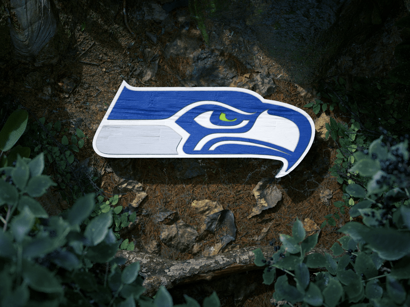
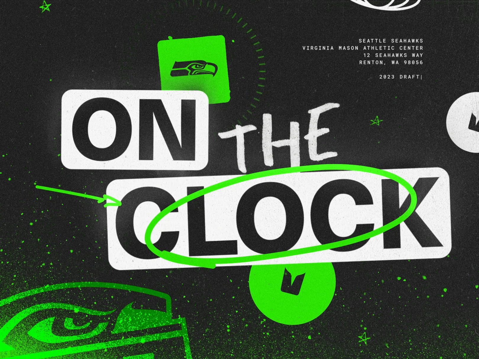
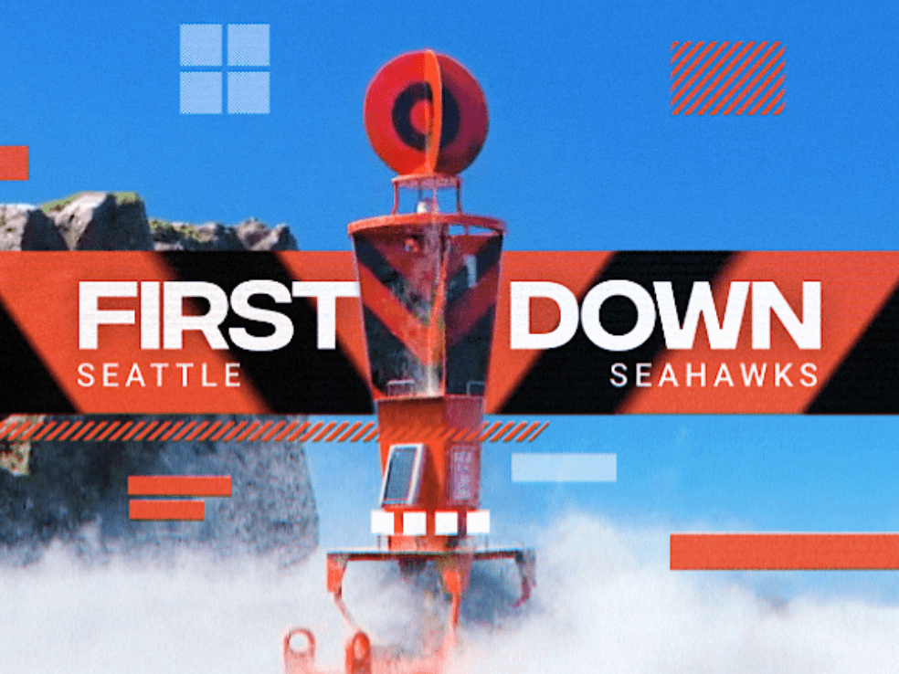
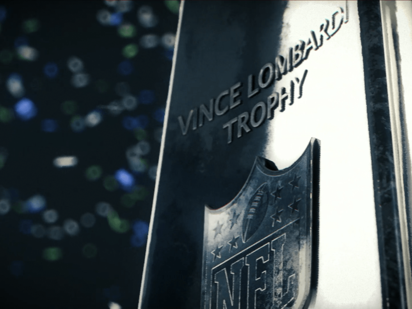
Attached is one of the first projects I was assigned once I became full-time at the Seahawks. In 2021, we were going into a rebrand and I was tasked with providing some examples of how that could look from an animation standpoint. One of the things I really wanted to focus on was to elevate a design "main character" so to speak, and landed on our Feather Badge. Below are some examples of me experimenting with our brand assets, style guide and previous year's work to bring our Feather Badge to life!
The top row depicts what a Feather Badge evolution might look like throughout the course of a game. Obviously in an ideal sports world you want to keep the hype going from beginning to end, though inevitably there will be setbacks. The bottom row depicts this as alternate forms - "Shocked", "Respawing", "Planning". I really wanted to approach it iteratively, almost like a game. And I mean, in a way it was.

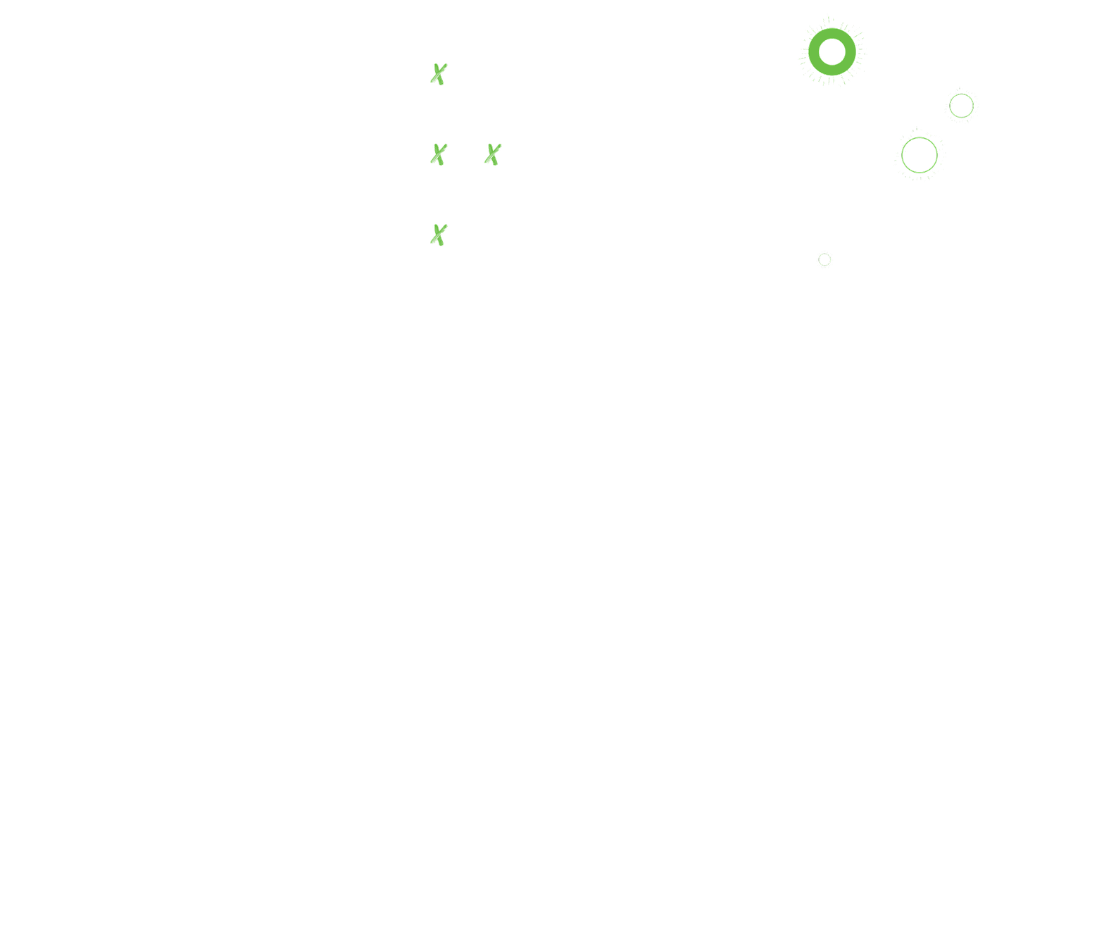


Last thing I'll say about this project involves some of the thought process behind the modular X and O elements. I wanted to have a very poppy animation style but also to tie it back to the sport itself, hence the Xs and Os. I was also beginning to experiment with particle simulations on the side so eventually came to the conclusion "Why not treat the Offense and Defense symbols (Xs and Os) as particle/anti-particle pairs, the ones that pop in and out of existence upon contact with one another"? Absolutely no fan would get it, but the aesthetics were there!

